Design Direction at Bitget
Raising the visual and motion standard of a growth design team
This page is not a single project. It documents how my direction shaped other designers’ work at Bitget, across visual language, layout, and motion and interaction.
The first half shows pages delivered by designers on my team under my direction. The second half follows how motion went from nearly absent to standard practice, and how I connected design and engineering to make it ship.
- Role
- Art directionMotion directionInteraction direction
- Platform
- Website
- Duration
- Sep 2024 – Aug 2026
How I direct
Direction through iteration, not instruction. I rarely issue a list of fixes. Each page takes shape over several rounds: I set and recalibrate the direction, explain the thinking behind it and lay out the underlying structure, and reserve specific changes for problems that are fundamental. Most pages take two to four iterations from first review to delivery, depending on the brief and on how familiar the designer is with that kind of work. When a designer still cannot reach the intended result, I step in and design it myself, so the standard holds.
Bridging design and engineering. Ambitious effects usually stall at implementation, so I start from a reference that already works and bring the front-end engineer in early to plan how it will ship. Having worked in front-end development, I can recommend an established library that suits the effect. Building on a proven package removes the cost of engineering it from scratch, which makes engineers far more willing to take the work on. Through delivery I review at each milestone, give concrete feedback, and join design reviews to help designers and engineers agree on how it will be built.
Turning one-off work into shared assets. Approaches that prove themselves are folded back into the design system. Because the growth team produces a high volume of landing pages, we also maintain our own component library for them, so proven sections are reused rather than rebuilt.
Visual and layout
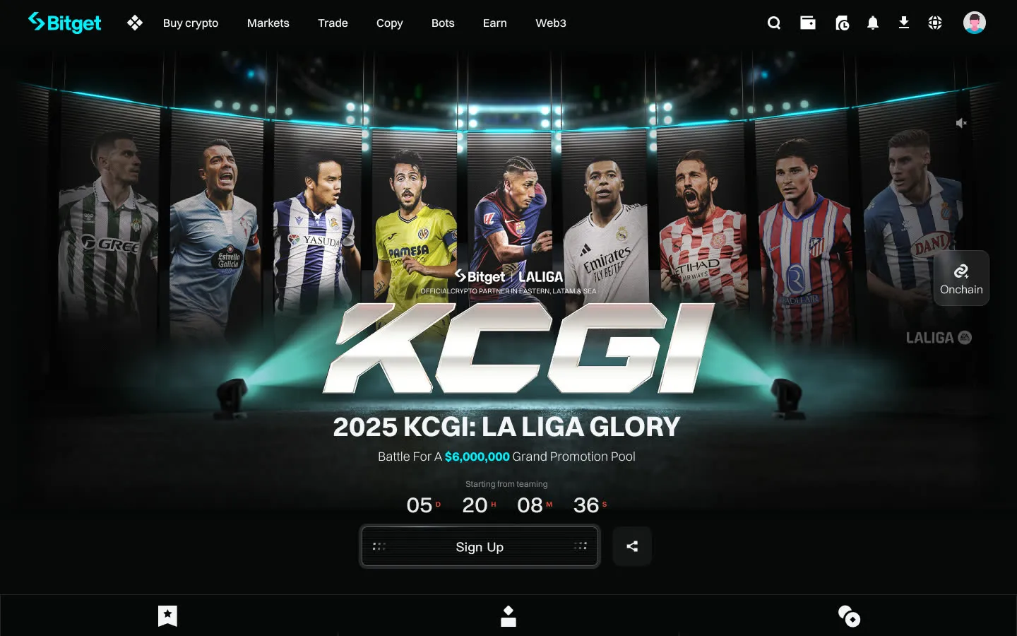
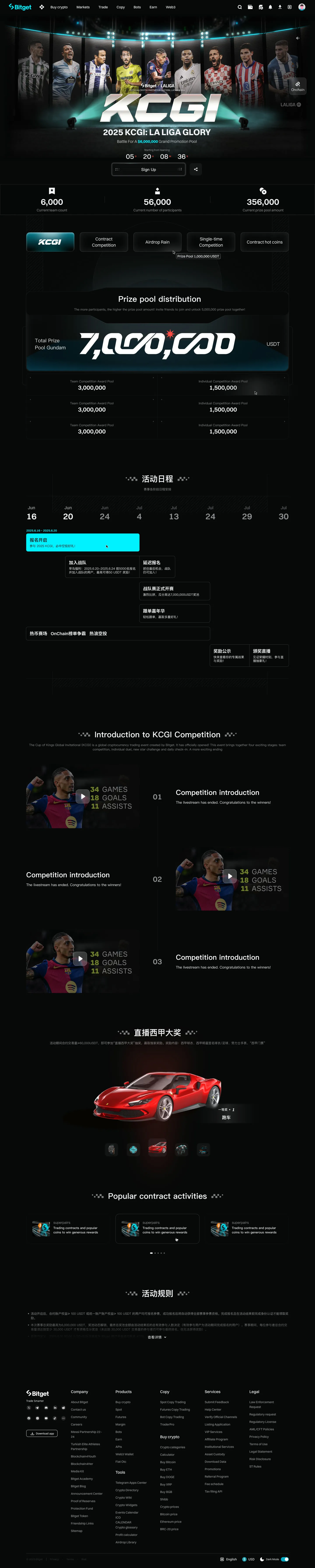
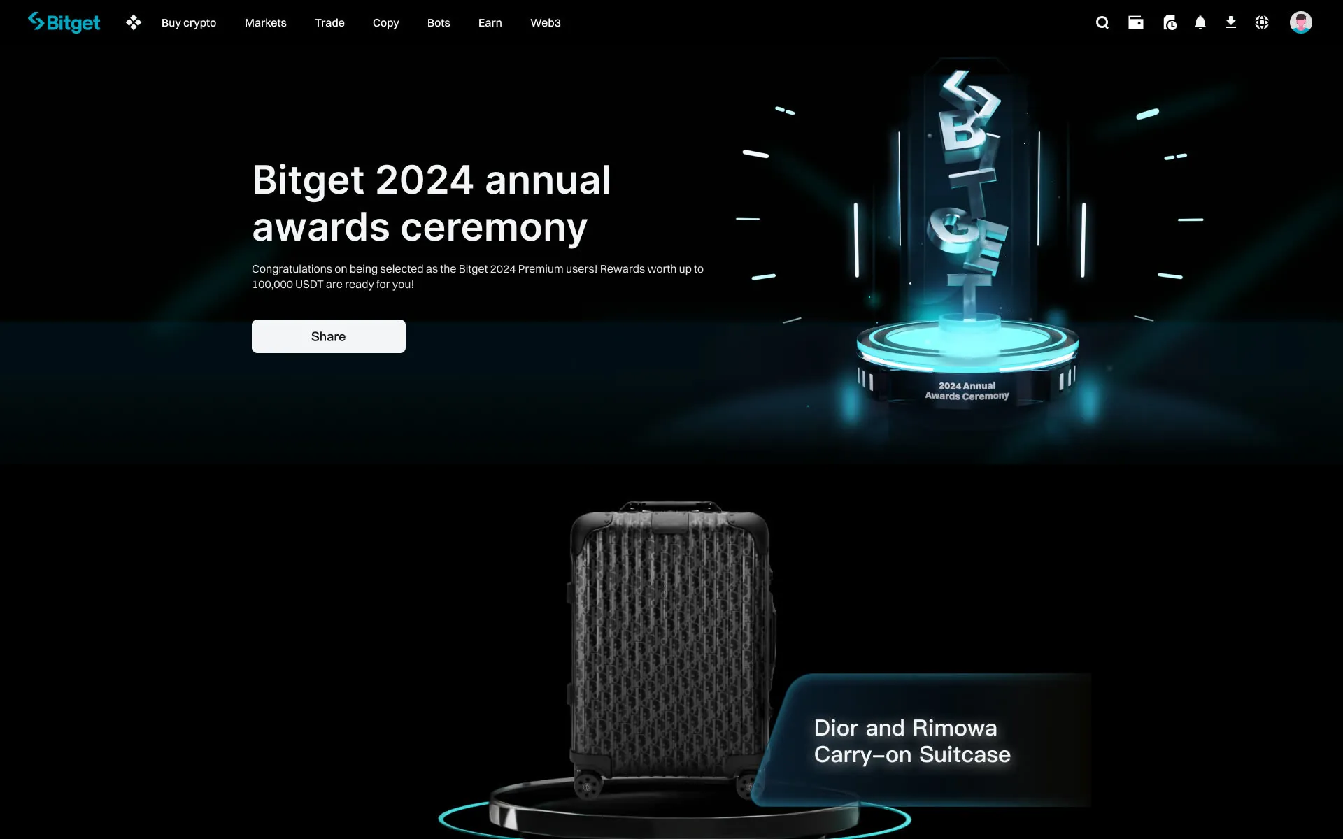
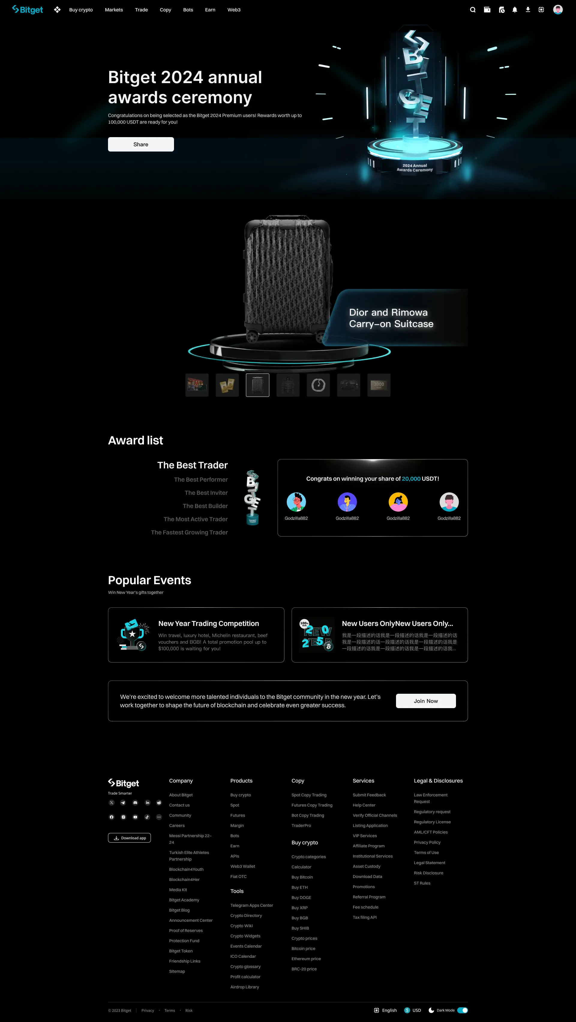
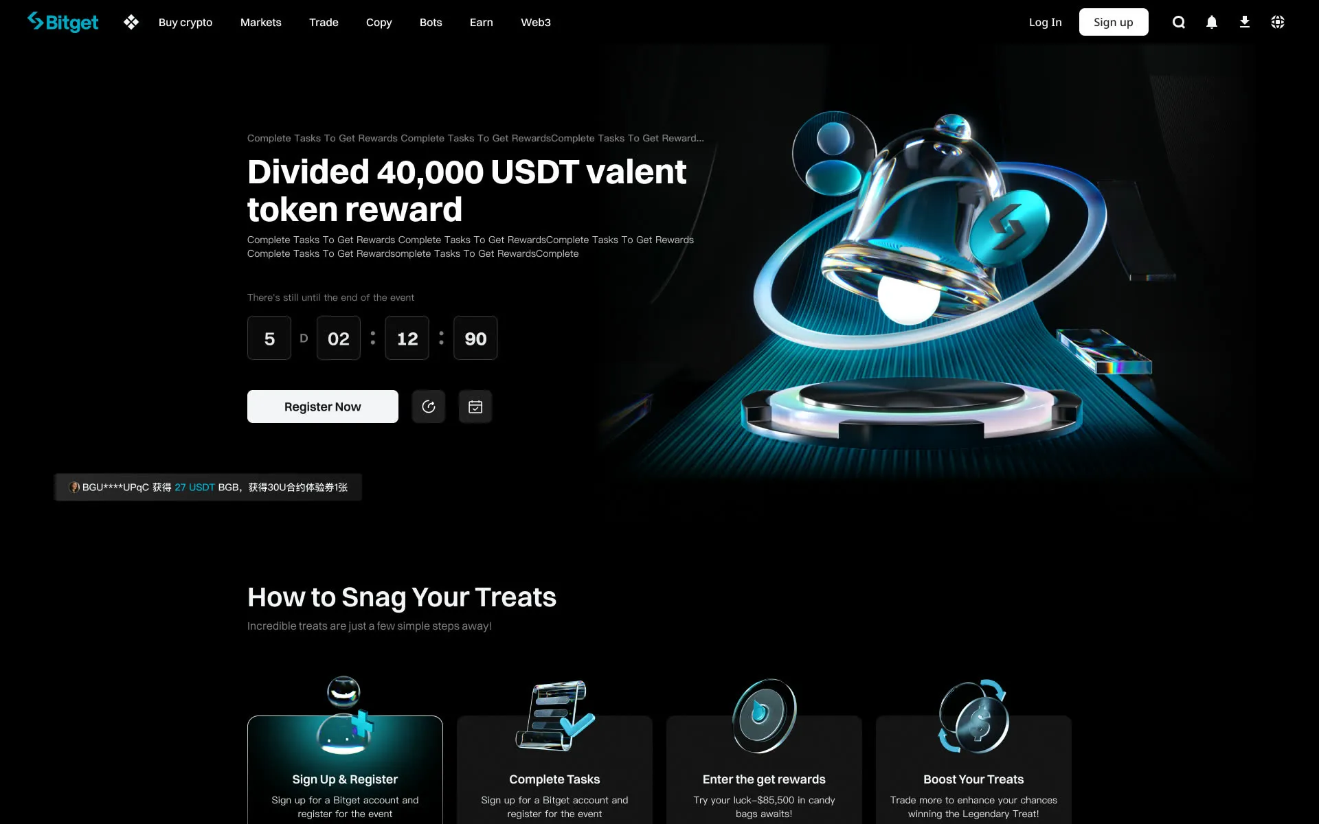
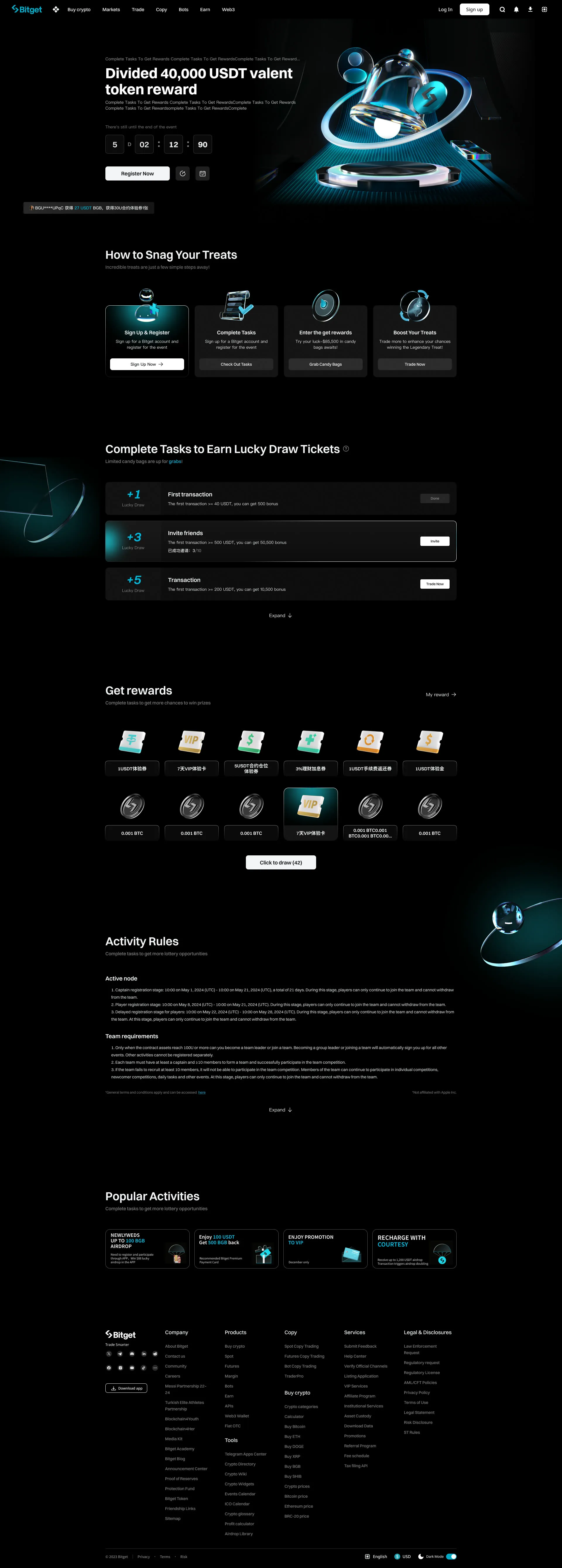
The pages below were delivered by designers on my team under my direction. They carry the visual language set in the homepage redesign: 3D material, a restrained palette, and consistent rules for type and corner radius.
KCGI trading competition
The full page below scrolls like the live site.
Bitget 2024 annual awards
The full page below scrolls like the live site.
Campaign pages
The full page below scrolls like the live site.
Motion and interaction
Before I joined, motion was largely absent from the team’s work. No one proposed it, and few designers had the means to: motion thinking was rare, and the animation that did appear felt mechanical, without a grasp of keyframe easing or of how it would be implemented. My background in animation and front-end development let me see both the craft and the build path, and showed that well-chosen motion costs far less than teams expect relative to the improvement in experience.
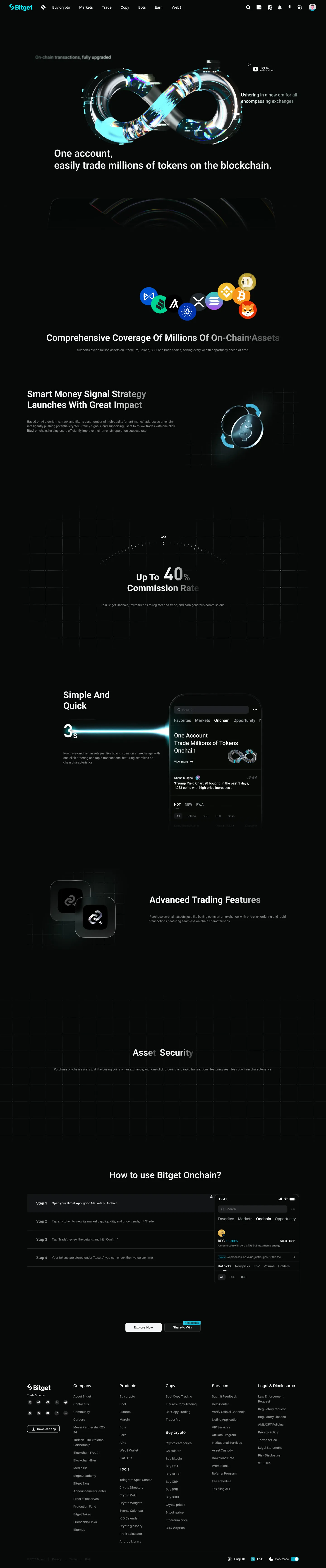
Onchain was the first page to use parallax motion. I proposed it and aligned with front-end before taking it to product, presenting the approach through a technical framework I had already selected, so both sides would build on a known foundation and the collaboration would stay predictable. The resistance was predictable too: richer effects take longer, and engineering and product were both under pressure to launch. My case was that the additional time is worth it, including how well-designed micro-interactions can support conversion. Once Onchain shipped as a working example, the conversation changed: designers were willing to experiment, and other teams began asking for pages built the same way.
In day-to-day direction I focus on three things. Timing and easing, since designers new to motion tend to produce curves that feel uneven. Visual flow, judging from the user’s side which motion guides attention and which competes for it. And references, supported where useful by After Effects and Lottie files I prepare myself.
Performance was part of the design from the start. Working with front-end, we kept payloads small: WebP assets, and a pre-rendered frame-zero still that appears before the animation loads and gives way to autoplay once loading completes. On low-end phones where an animation cannot run, the page still shows a complete image. Vector-based animation is delivered as Lottie.
The pages below were built by designers on my team under my direction, not by me hands-on. All of them are responsive, so every motion concept had to hold up on a phone as well as on desktop. Motion has since become a standard part of nearly every page the team ships.
GetAgent
The opening animation brings together two ideas: Bitget’s arrow mark and the agent itself. The GetAgent icon is built from two arrows and a pair of eyes, and the chevrons unfold to reveal it.
View live page (opens in a new tab)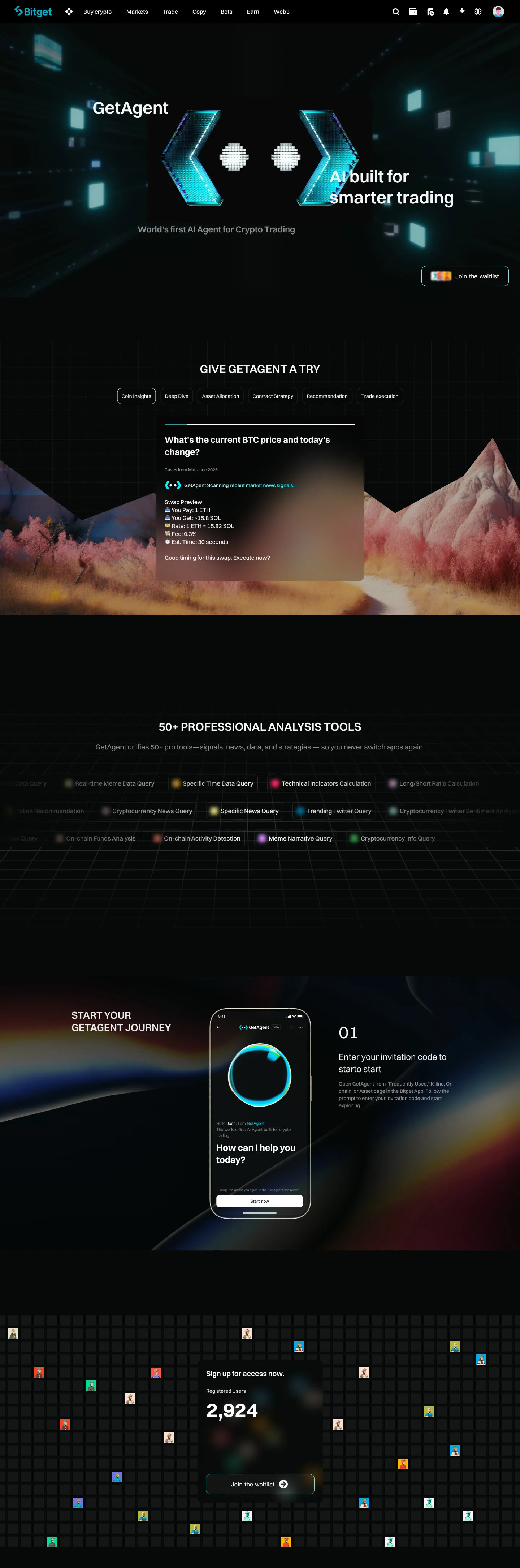
Bitget Onchain
The team’s first page with parallax motion. The infinity loop expresses the breadth of the product: an almost unlimited range of tokens, tradable on chain from a single account.
View live page (opens in a new tab)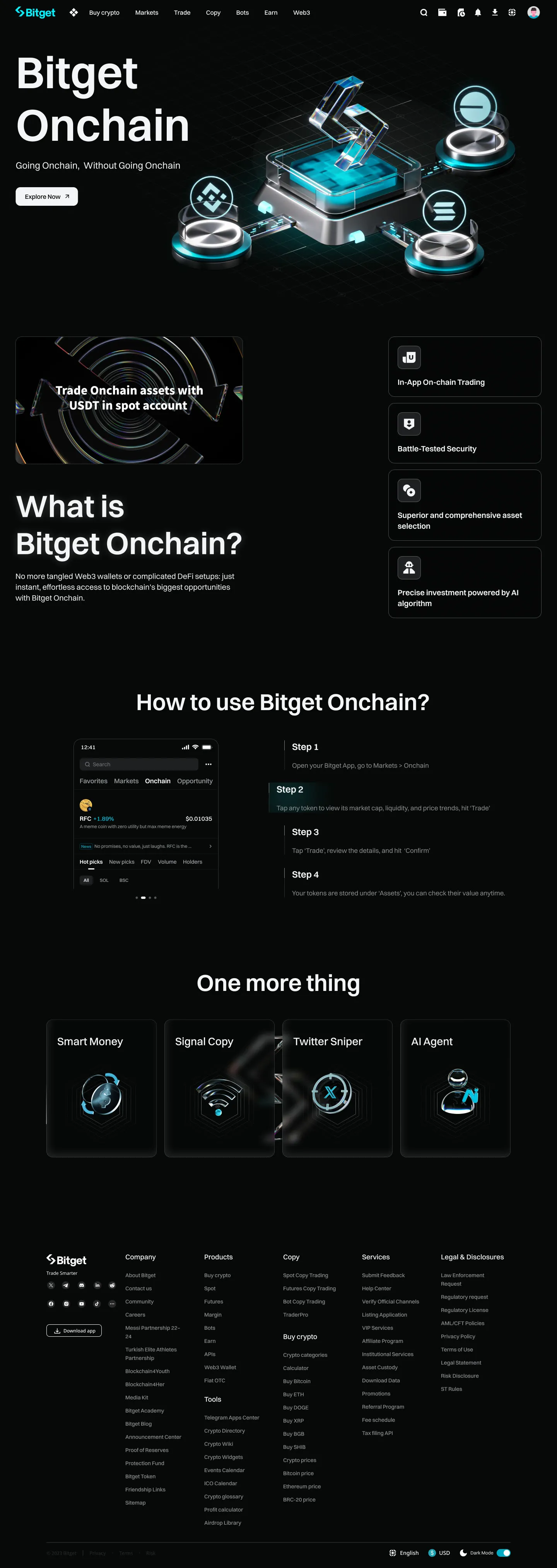
TradFi futures
Motion turns the trading panel into a guided preview, showing users the complete trading interface at a glance.
View live page (opens in a new tab)Bitget × MotoGP
Designed to feel closer to a game. The page lets fans follow the MotoGP season race by race, and the campaign included a dedicated game alongside it.
View live page (opens in a new tab)