Modular Landing Pages at Bitget
A shared design language for different product stories
Product landing pages need to explain different features while still feeling like one brand. At Bitget, we approached them as a system of reusable modules: a shared structure for presenting a product, showing how it works, explaining its advantages and guiding the next action.
This case follows the team’s modular design approach, from layout proportions and content variants to desktop and mobile composition. The TradFi design examples show how the rules come together on a page.
- Role
- Modular designLanding page guidelines
- Platform
- Responsive website

Organise the page around its content
We organised the guidelines into five module families: hero, market data, product content, advantages and calls to action. Each has a distinct job, so a new page can start with its communication needs and select the modules that fit.
The system defines common spacing, typography, corner radii and image boundaries, while leaving room for different product visuals and content density. Consistency comes from those shared rules, rather than repeating an identical page for every feature.
- Hero — establish the product proposition and the primary action.
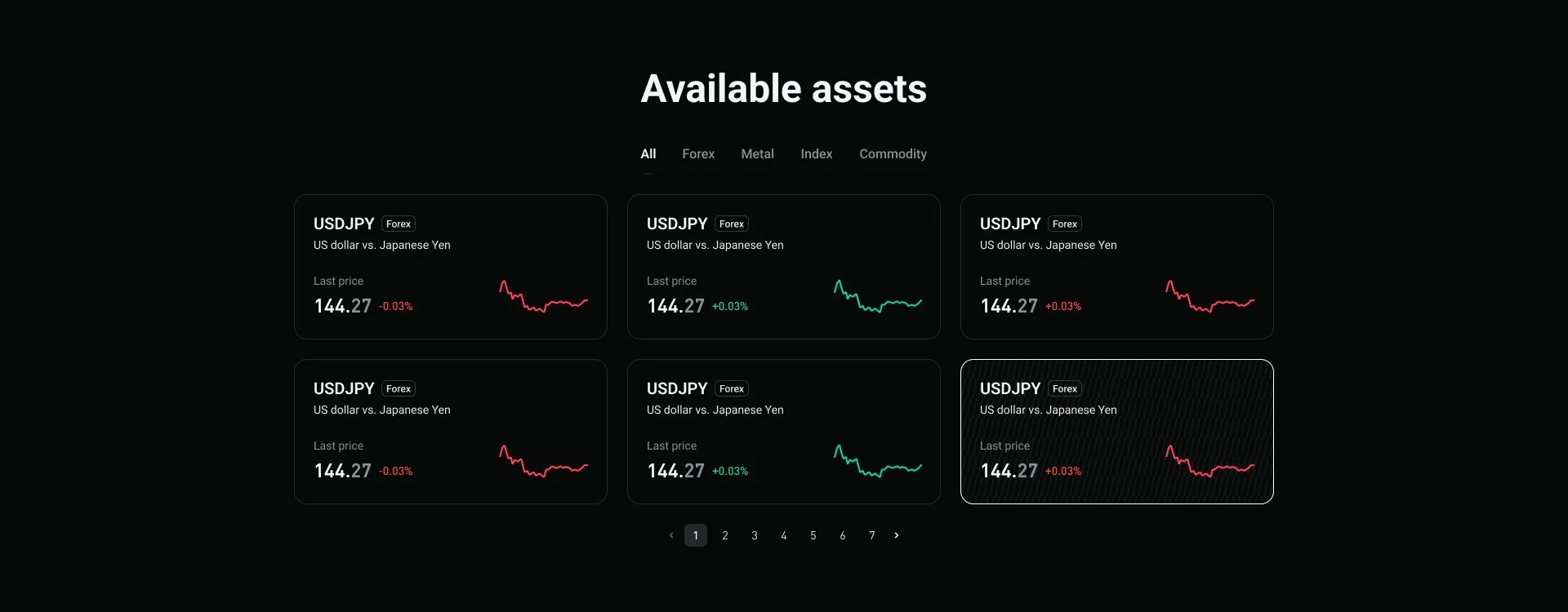
- Market data — present available assets through cards or a denser table layout.
- Product content — explain a feature with text, an image, a video or an interface preview.
- Advantages — choose an image, icon or text treatment to match the supporting points.
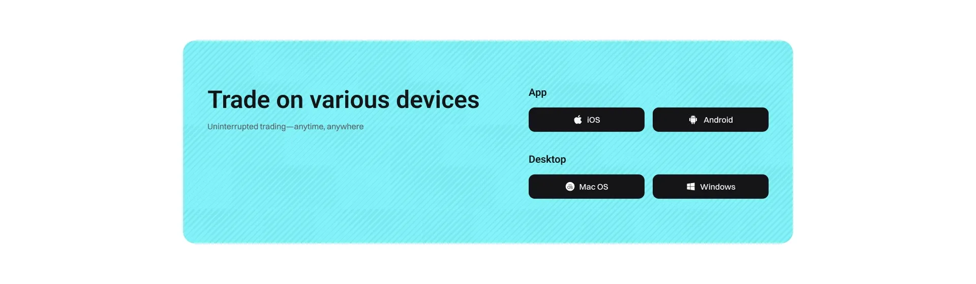
- Calls to action — adapt the closing module to one action, two actions or multiple platform downloads.
Use proportion to express priority
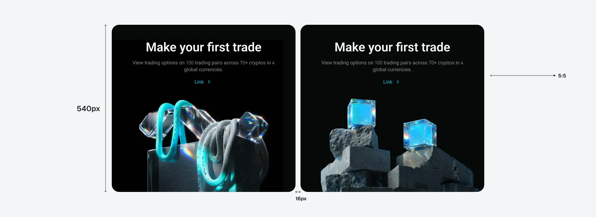
The layout concept uses relative widths of 10, 7, 5 and 3 to describe the role of a card. The proportions give the team a common way to discuss hierarchy before choosing the imagery or polishing the layout.
- 10 — full width for a core proposition, a large product view or a concluding action.
- 7 + 3 — give the main demonstration more space and pair it with supporting explanation or evidence.
- 5 + 5 — present two features or advantages with equal weight.
- 3 + 3 + 3 — show a set of supporting points in parallel, with room for whitespace.
Choose variants by information density
A module is more than a fixed visual container. Market data can use cards, with or without asset imagery, or a table when more information needs to be compared. Product content can use a left–right image and text pairing, a video, equal-weight cards or a large interface preview.
The content guidelines also set a limit on visual exceptions: full-width scene renders can break up a card-heavy page, but should generally appear no more than twice on one landing page. The aim is to preserve a clear reading rhythm while allowing expressive product imagery.

Keep the action clear
The closing CTA follows the same modular approach. Its structure supports one or two actions as well as a group of download options. The choice follows the next step the page needs to offer, while shared spacing and type keep the variants related.
The guidelines include both restrained brand-colour treatments and richer material-based backgrounds. This lets the final section carry the page’s visual direction without changing how its actions are organised.
Recompose for mobile
The responsive rules change the composition rather than simply shrinking it. Full-width, main-content and equal-width cards become full-width modules on mobile. Smaller supporting cards can appear in pairs when their content is brief, or use a horizontal sequence when appropriate.
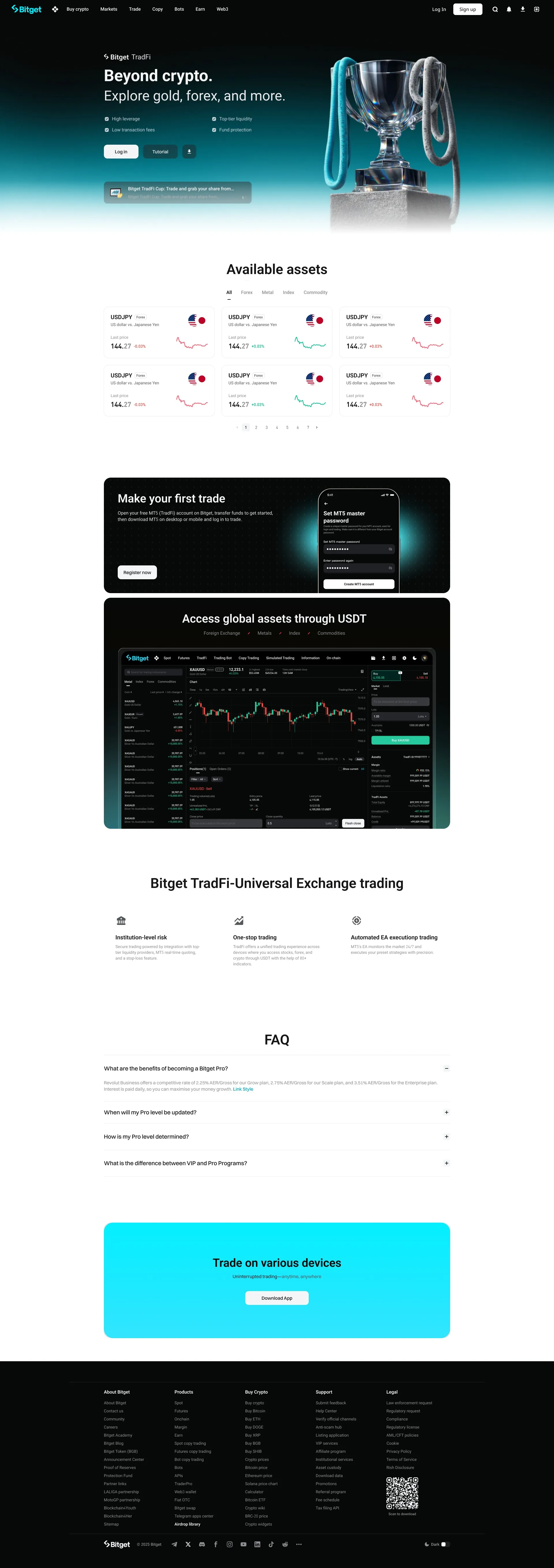
The TradFi desktop and H5 designs below show the system at page scale: the product introduction leads into available assets, product demonstrations, advantages, FAQ and a closing action. These are design examples from the module guidelines.

Make the next page a composition task
The intent is to move repeatable layout decisions into shared guidelines, so the team can focus on the product story: which information leads, what needs a demonstration and which action comes next. New pages can combine existing modules while keeping their own content and visual emphasis.